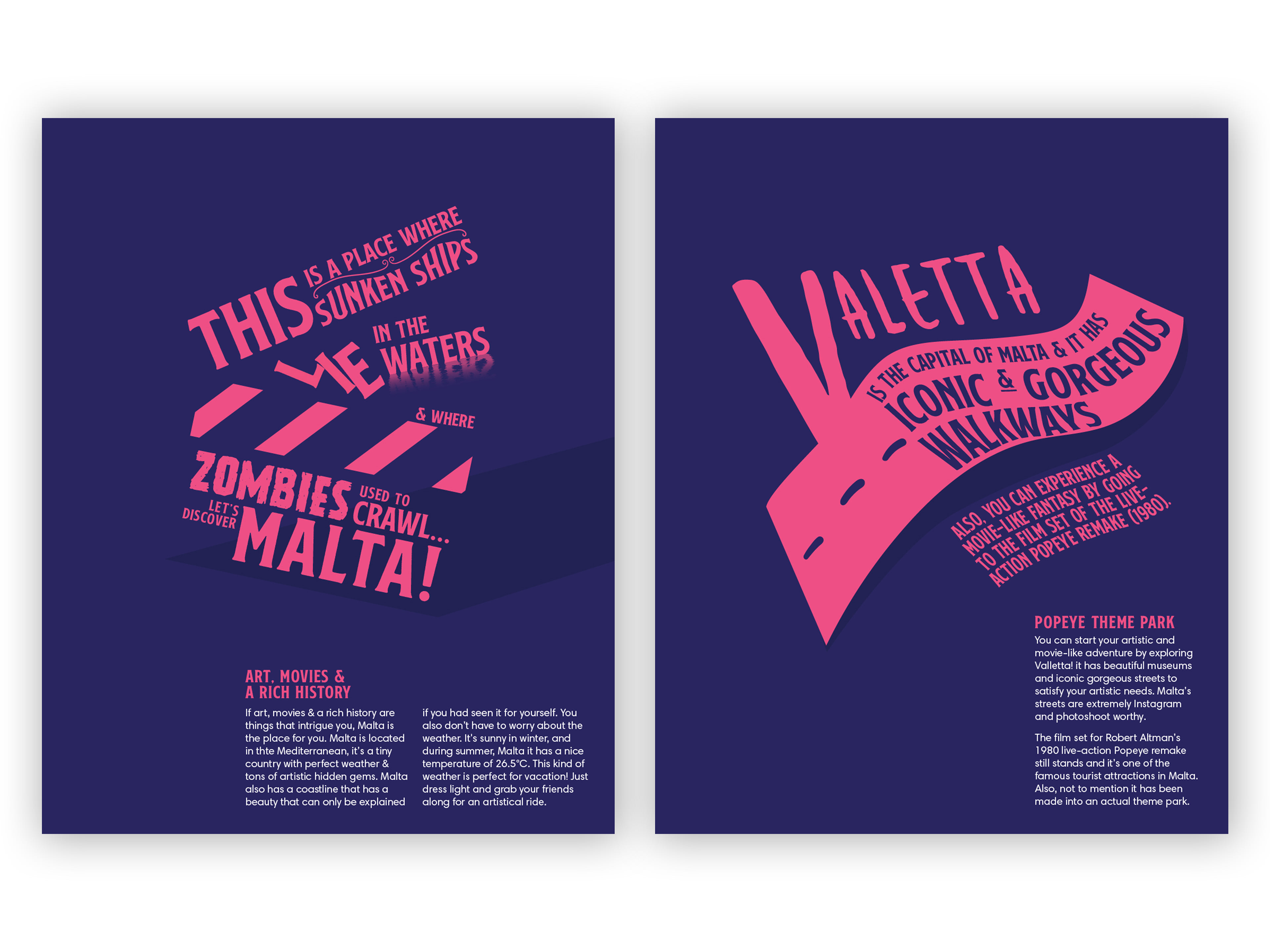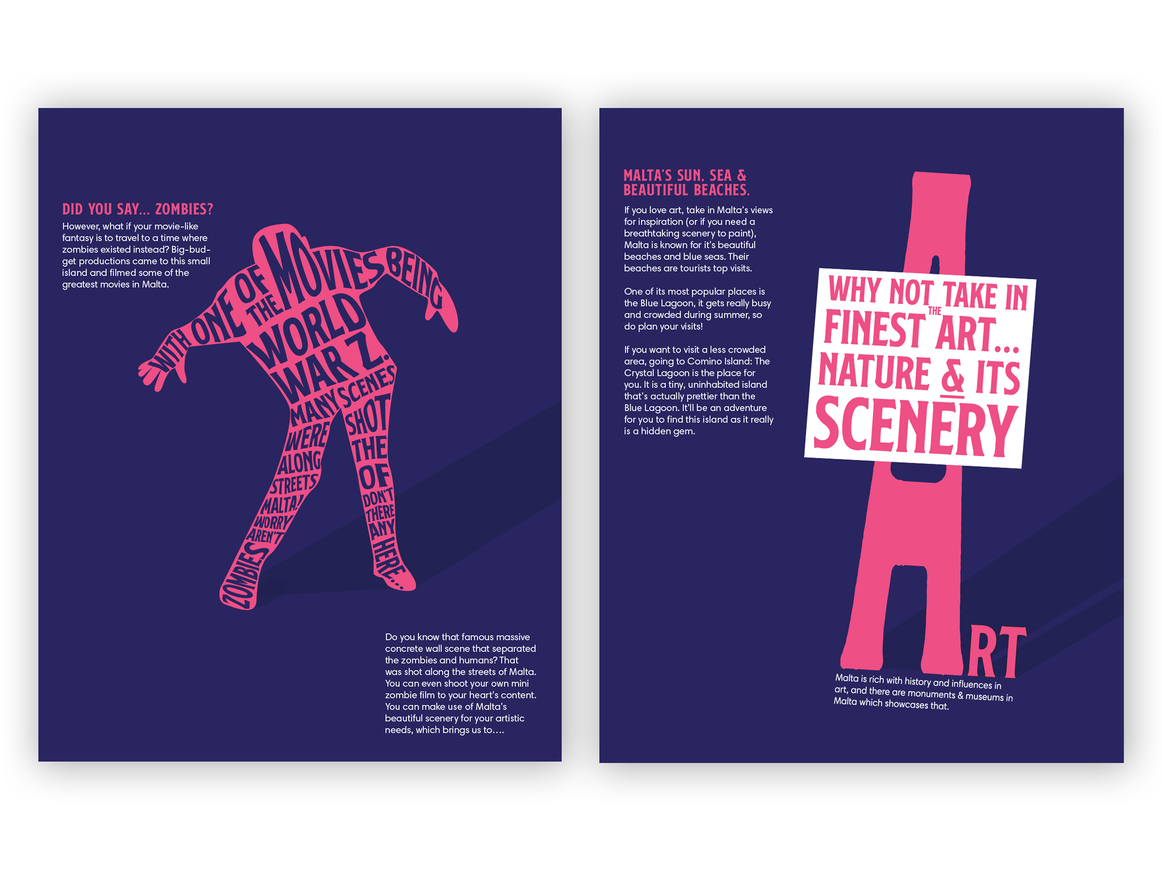

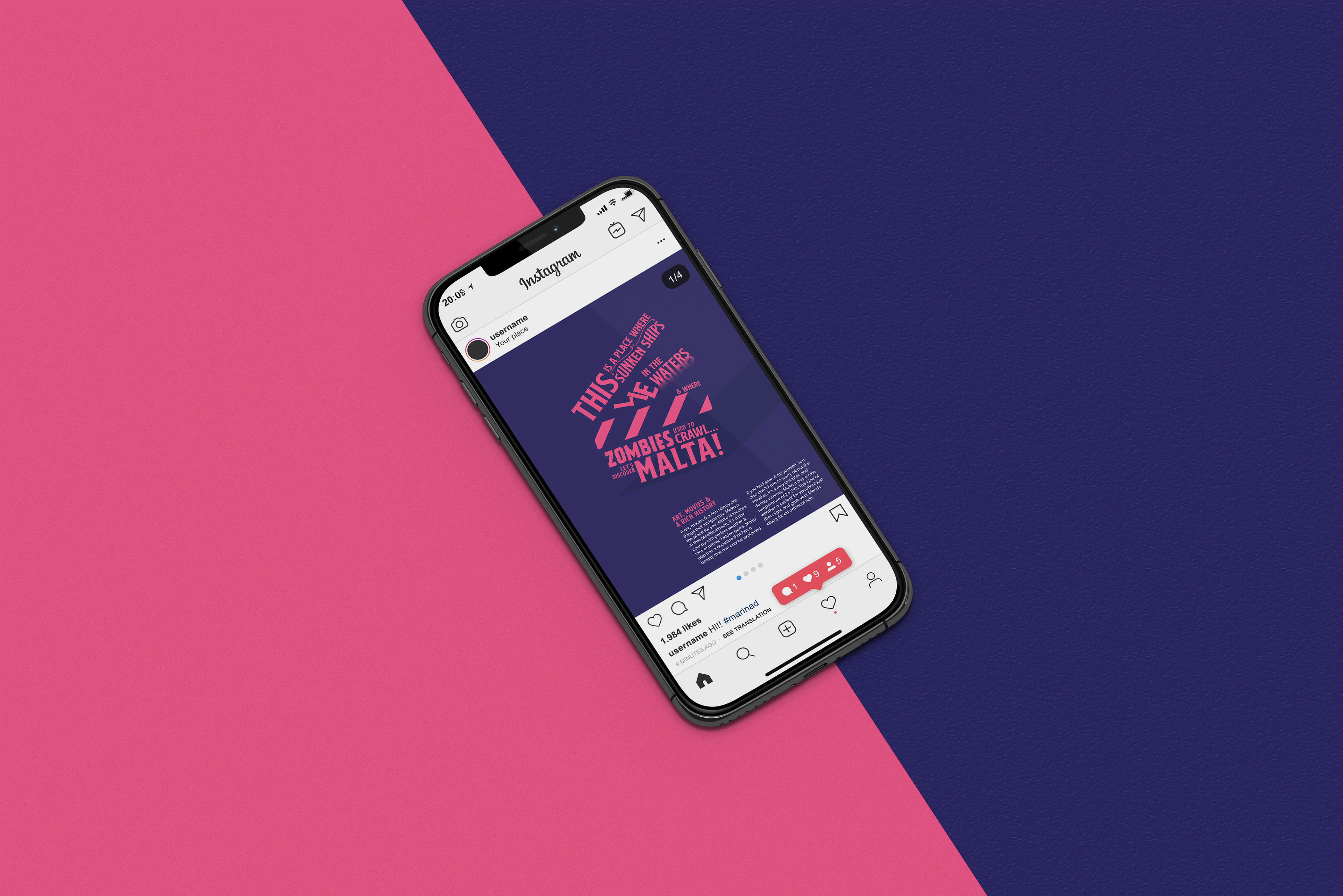
Malta is known to be a country with lots of youthful attractions. In the morning, tourists would go for a dive/in the waters or a walk around the island. There are private boat rides, amusement parks, and water parks. I created a series of posts to attract art students to visit Malta.
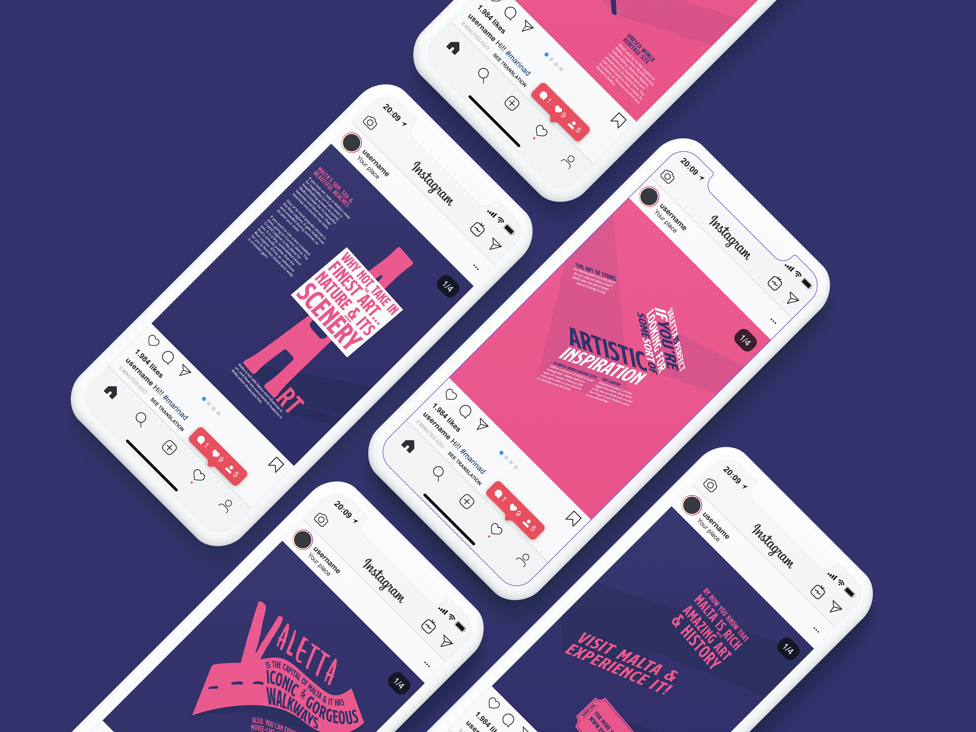
Attracting the audience
In the Instagram posts, I included the famous art sites that Malta is known for, including the hidden gems. Anything artistic will attract the students. As students, they would be interested to know how travelling in Malta is easy, as everything is within walking distance.
Typography
I chose bright, contrasting duotone colours. I went for a colourful theme with experimental typography. I thought these combinations of duotone looked interesting and eye-catching. The post has a visually appealing centre element with a supporting description. The typography centre is the main idea for these posts.
Pantone
Using Pantone colours that contrast each other is also striking, especially with pink and blue. I used shadows to add emphasis to the main element and guide the user's eyes as part of the visual hierarchy. I also played with the colours and typography to achieve the visuals.