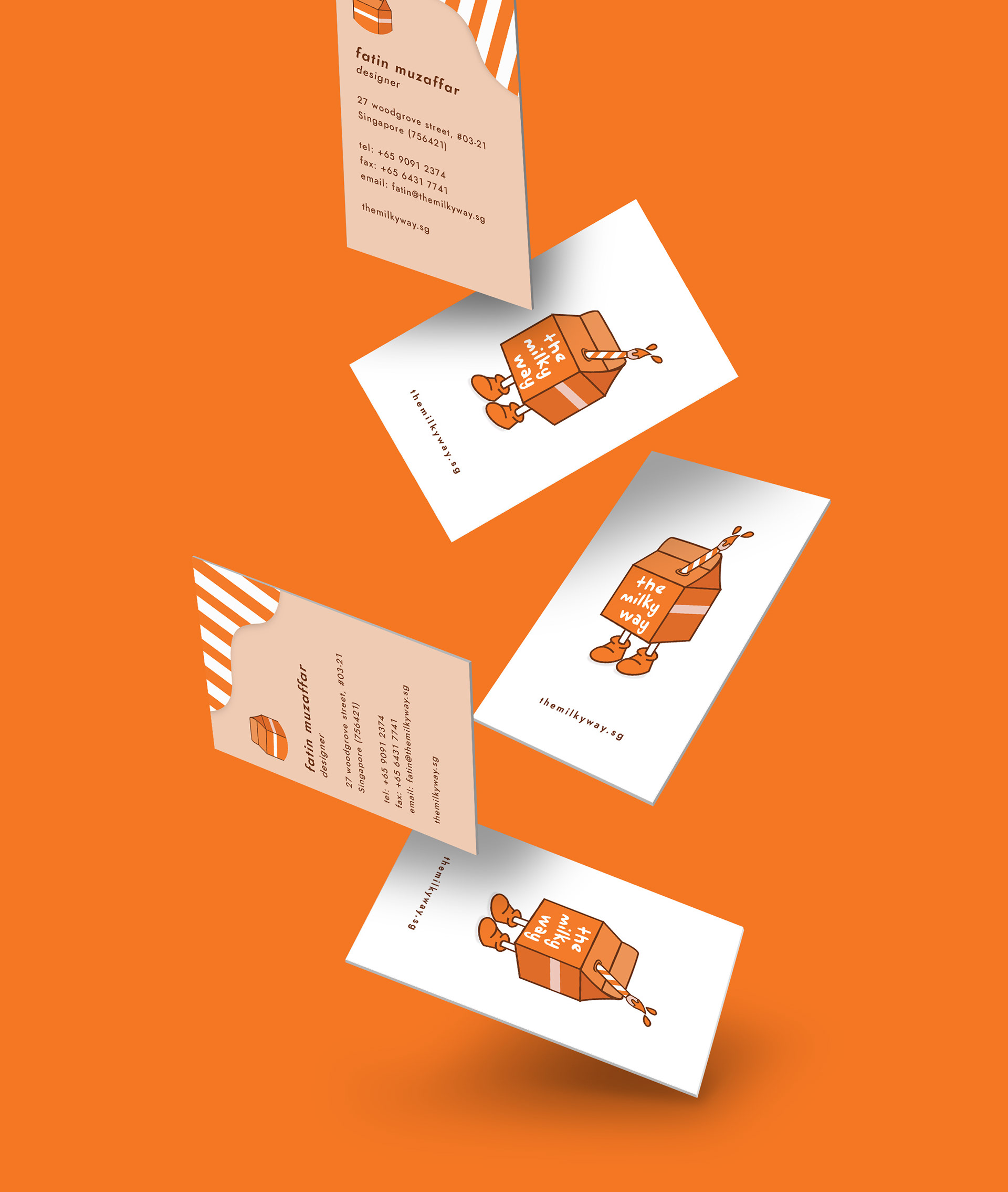
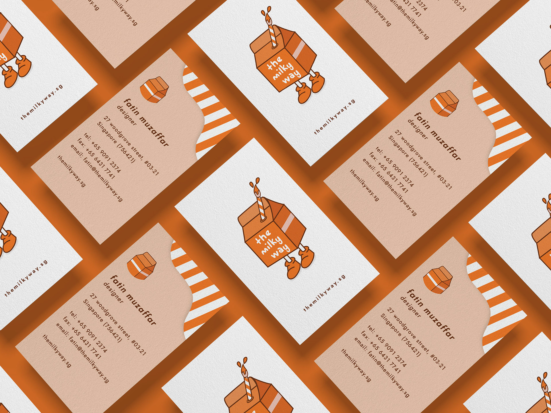
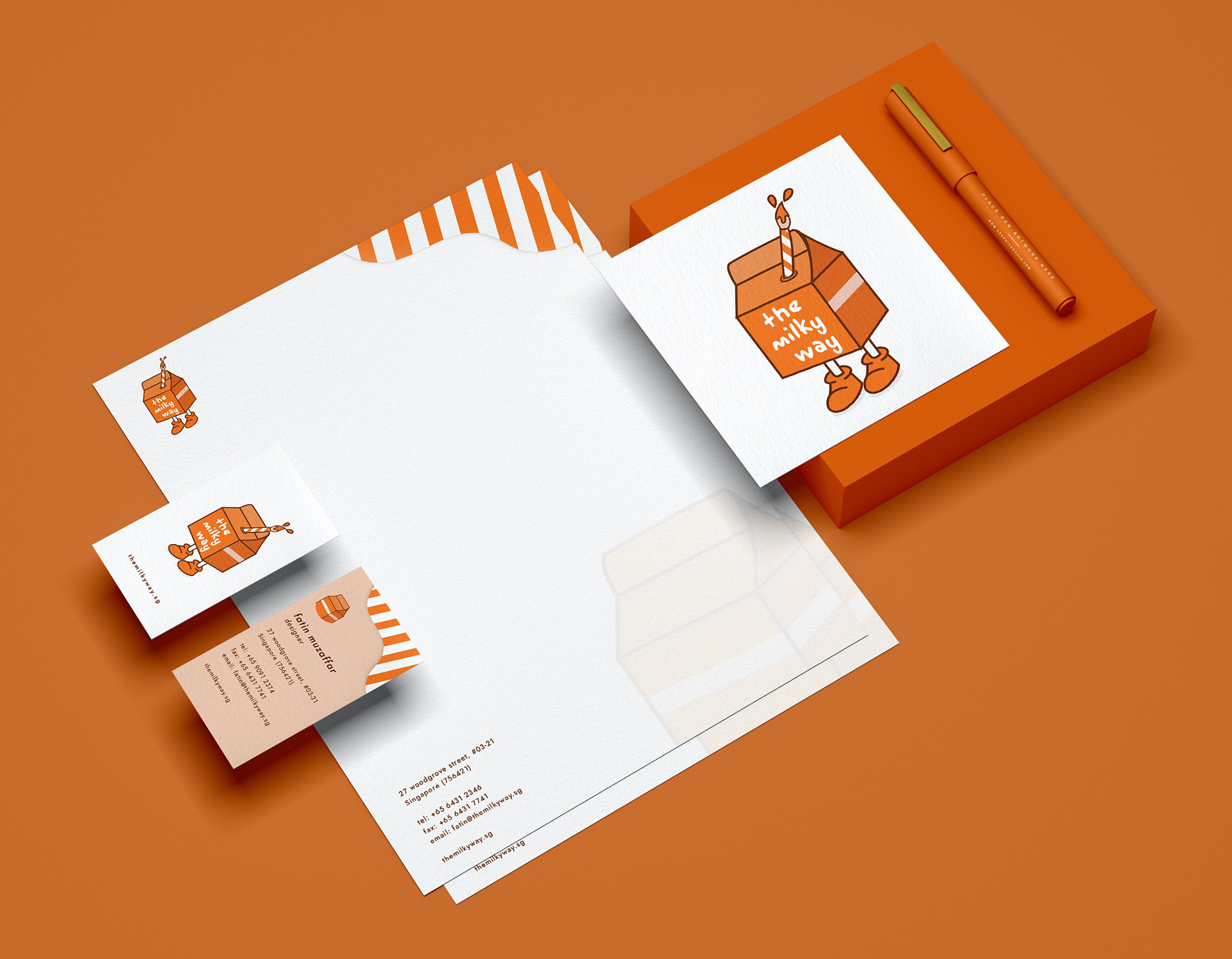
Brand Identity
I created a brand called 'the milky way' which is a design agency. It's a brand that mainly focuses on illustrations and branding, is very playful yet full of ideas (paintbrush). I interpreted that through the milk carton logo and the striking brand colour (orange). The name card has a simple and clean design that people can easily read off the information from. The logo identity is retained and showed across the brand. The milk carton also serves as a secondary logo for the brand.
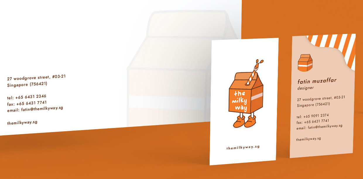
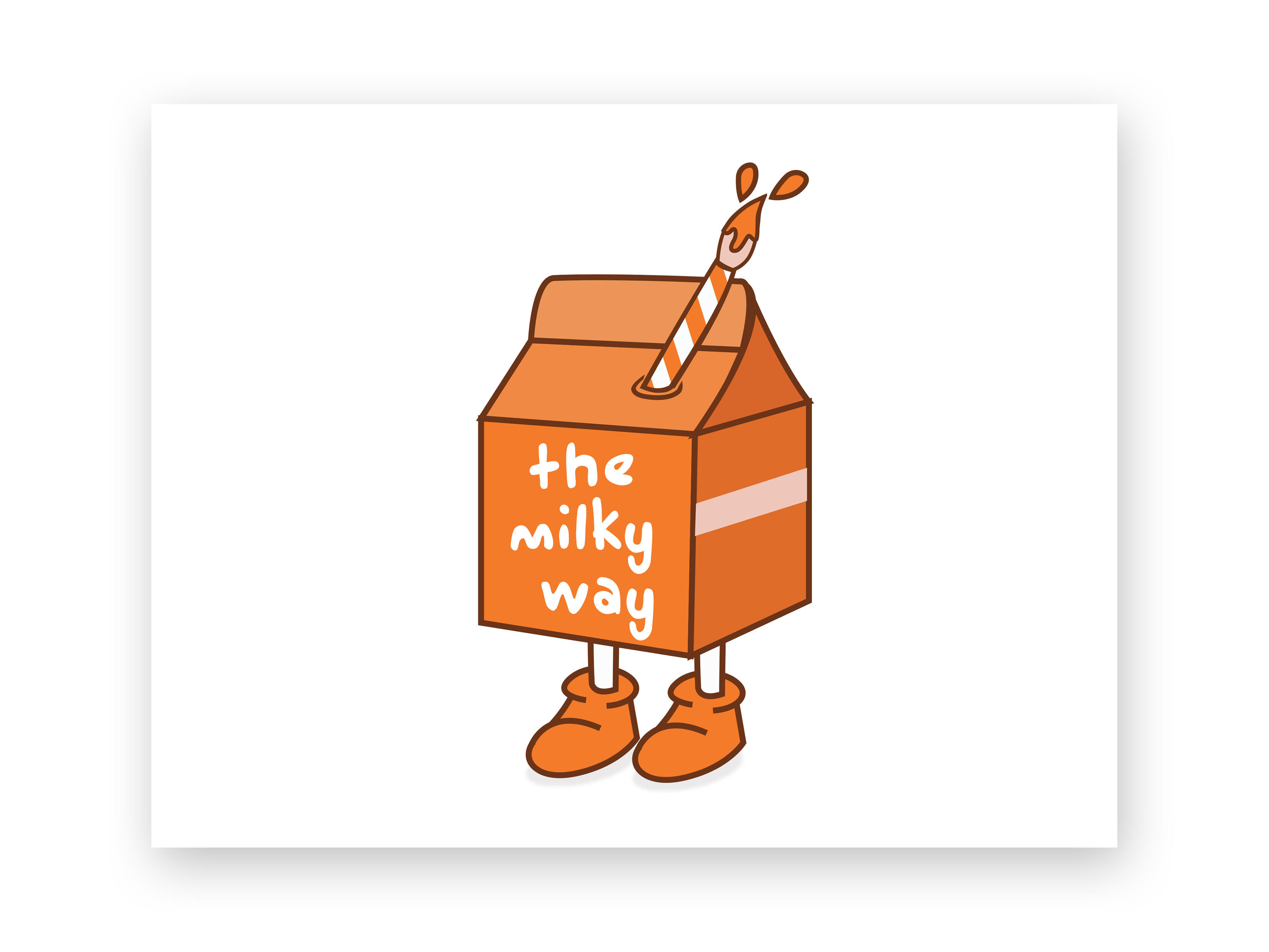
Milk Carton
The logo is quite straightforward. It's a milk carton with a paintbrush straw pierced in it. It's cute, stylish, and not to mention, different! The simple outline and strokes are not too detail oriented and would still be visible when zoomed out. It also adds to the illustrative style of the logo.