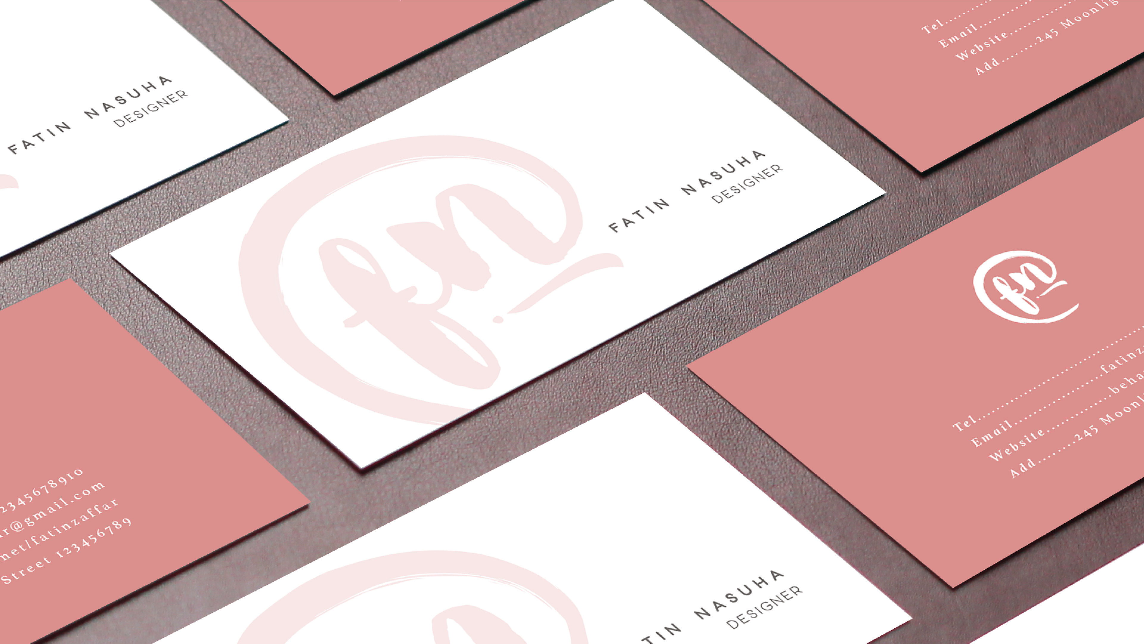
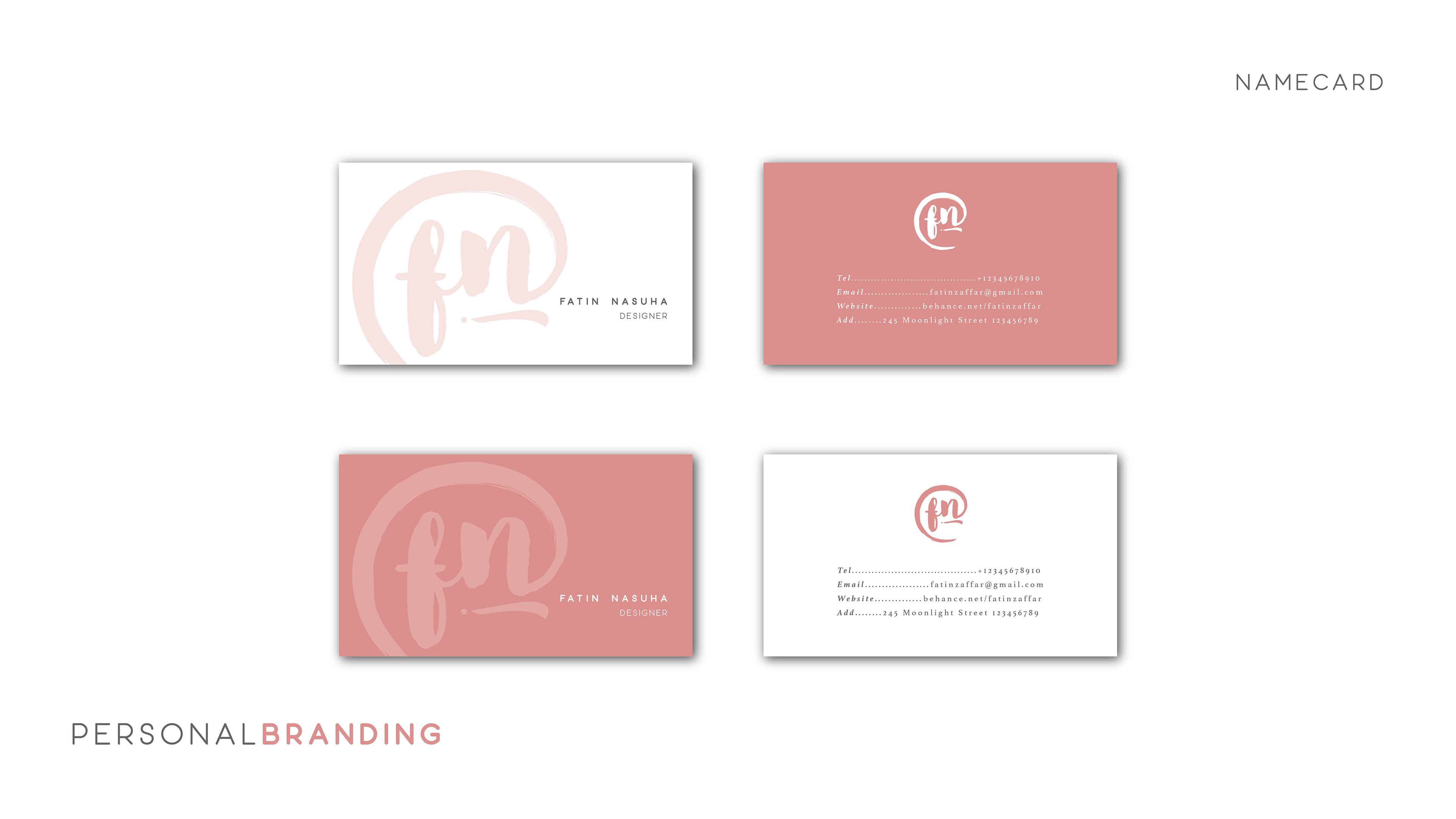
Past Identity
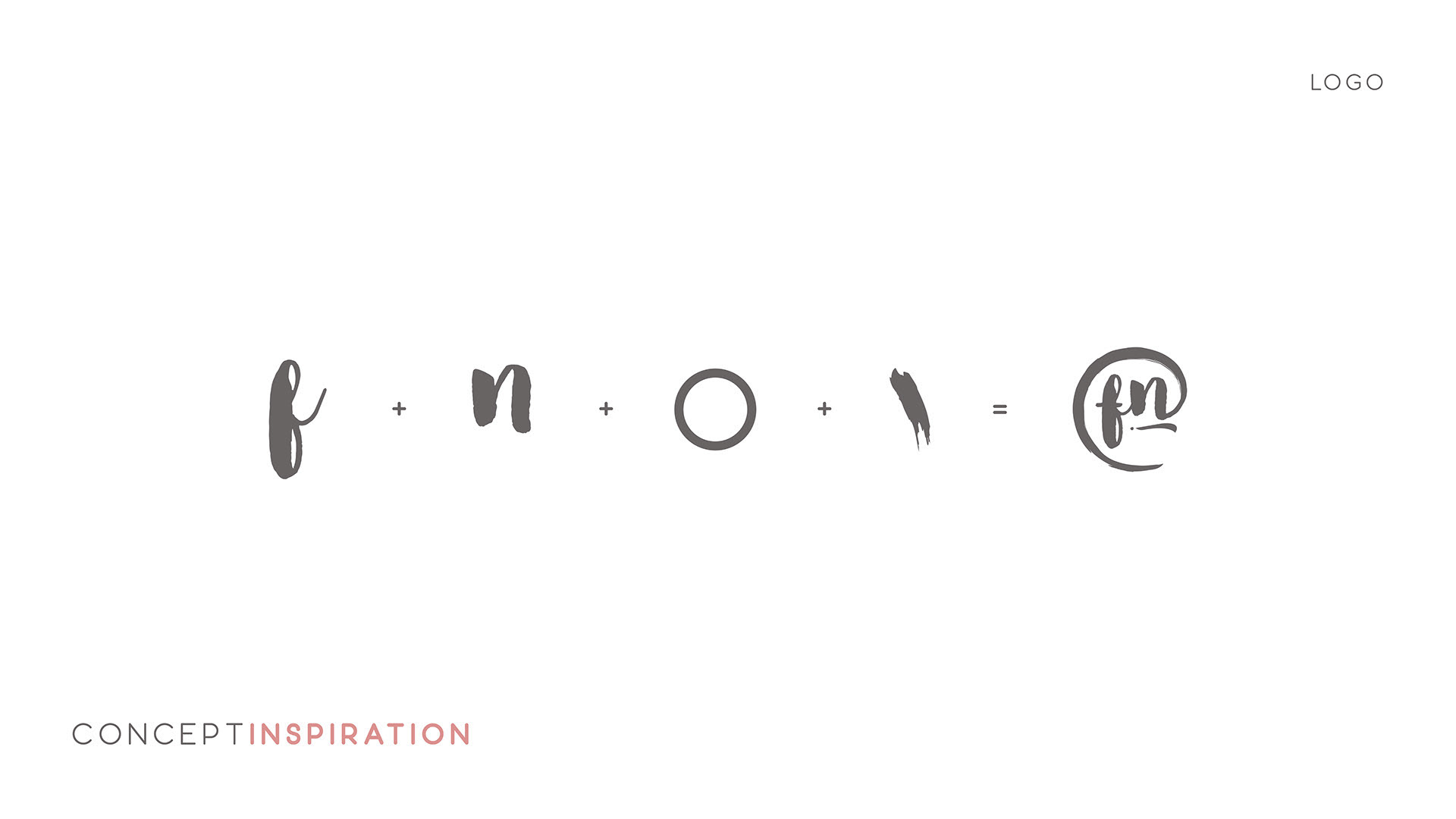
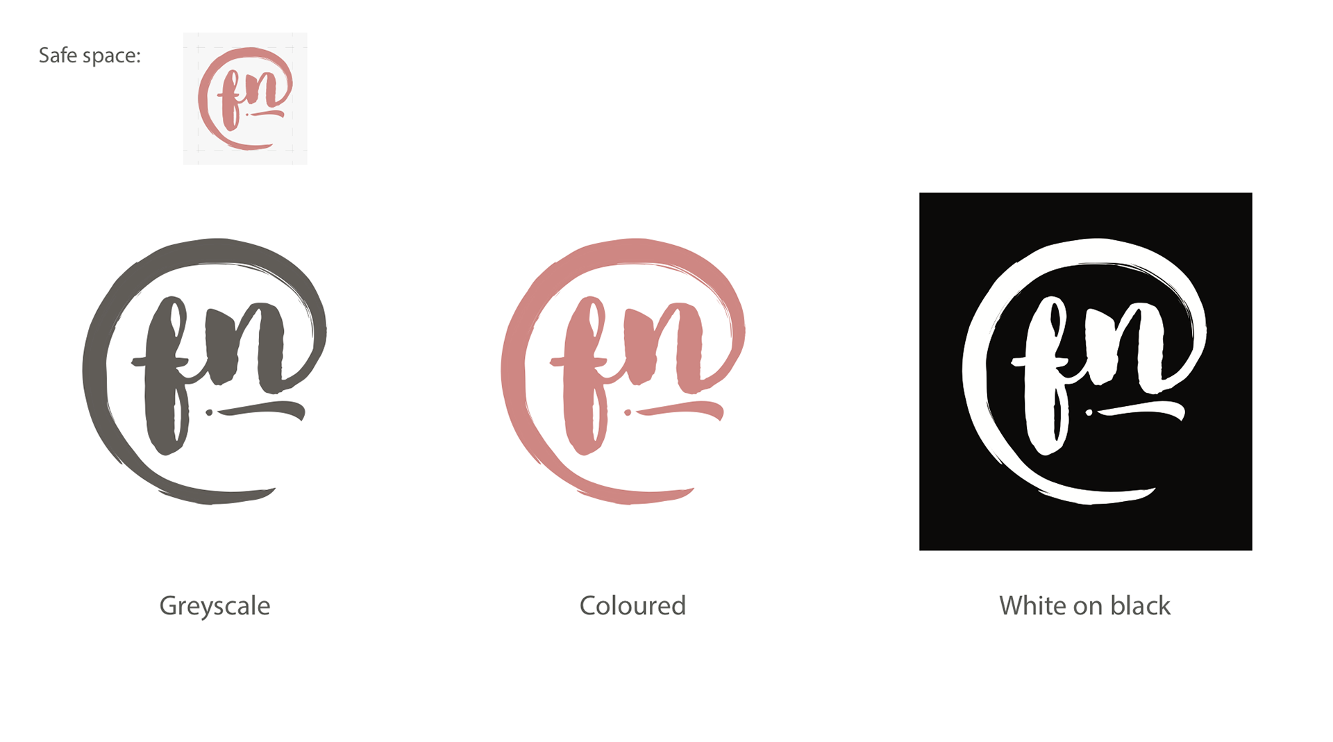
For my previous branding identity, I wanted to go for a simple look for the branding name card. The logo consists of a brush-like circle with my initials on it. Overall, my logo feels classy, yet the brush stroke contributes to the designer in me.
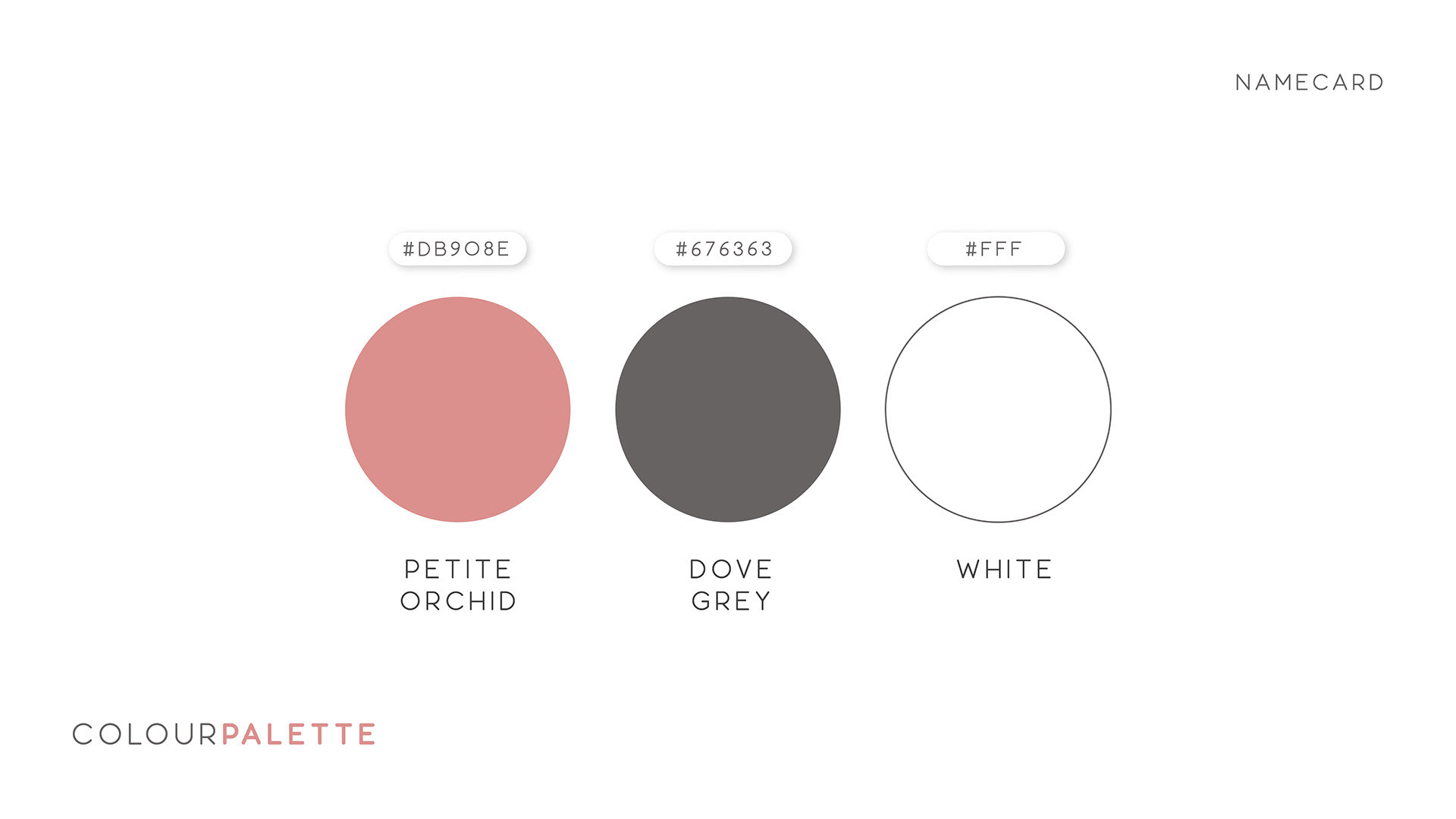
It's suitable as it looks simple yet professional enough to represent someone's identity as a designer. The colours are also neutral and pleasing to one's eye.
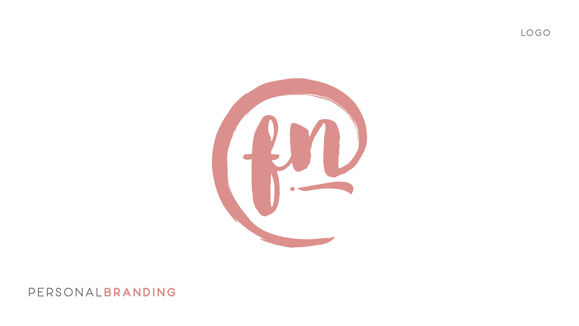
Logo
The logo is simple and easily recognisable. Though this was my previous branding, it still represents myself and my identity. I love painting, so the brushstroke represents my persona, though now I am more inclined to use more colours.